



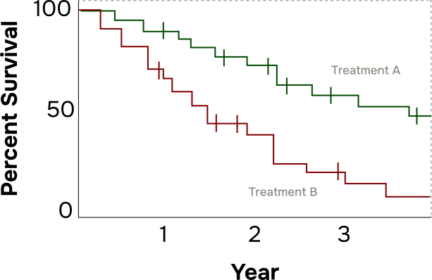
What is a Kaplan-Meier Curve?
A Kaplan-Meier (KM) Curve is a chart that shows how many patients in a study are doing well over time after starting a treatment.
How to Read the Chart
The median is the halfway point. Think of it like this:
If the median PFS is 12 months, that means half or 50% of the patients remain progression-free, while the other 50% of patients have experienced disease progression or death
A hazard ratio is a number that compares two treatments to see which one works better.
- Less than 1 = the new treatment is helping more
- More than 1 = the new treatment is not helping more
- For example a hazard ratio of 0.7 means patients on the new treatment had a 30% lower chance of getting worse 30% is 1 – .7 compared to the other treatment being studied.
Follow-up time is how long the researchers watched patients after treatment. A longer follow-up tells you more information about how well people did on treatment for a longer period of time, which is important because CLL & SLL is a disease people can live with for many years. The more time a treatment has been studied, the more we know about how well it really works.
How to Read a Side Effects Table
What the Table Shows:

Grades — How Serious Is It?
“Any Grade” vs. “High Grade”

What to Look For:
- Which side effects happened most often?
- How many patients had serious (Grade 3+) side effects?
- Are there side effects that are rare but very dangerous?
- Did patients have to stop taking the treatment because of side effects?


